Your landing page is the online face of your business. This article will make sure your business’ face is a smiling one.
Your landing page is what takes a random internet user and turns them into a lead or a customer for your business. Optimizing this page can mean an increase of thousands of dollars in revenue, as your conversion rate goes from 10 percent to 40 or even 50 percent.
In this article you’ll learn exactly what a landing page is, how to create one, and the five steps you need to take to create an optimized landing page that will make your business money.
What is a Landing Page?
A landing page is exactly what it sounds like: the page within your website that internet traffic “lands” on when they come to your site.
This traffic may have come from anywhere: your inbound or outbound marketing efforts, advertising, search, syndication, etc.
Ensuring this traffic takes an action your business wants them to is how we optimize a landing page. That action could be anything from an immediate product purchase to RSS feed subscription, giving an email address, beginning a free trial of your service, and many others.
Creating a Landing Page
There are two approaches when creating a landing page: going it alone by yourself or with a paid web developer, or engaging with a third party landing page building tool like Wishpond.
Because landing page optimization is such a never-ending development of testing, trialling, and constant adjustment, it can be easier to simply go with a software provider that uses optimized templates.
However, before you go jumping at the first provider you see, ensure they’re using sector-focused templates, as your target market is entirely different than the market of another business. Two different target markets may respond entirely differently to an “optimized” landing page.
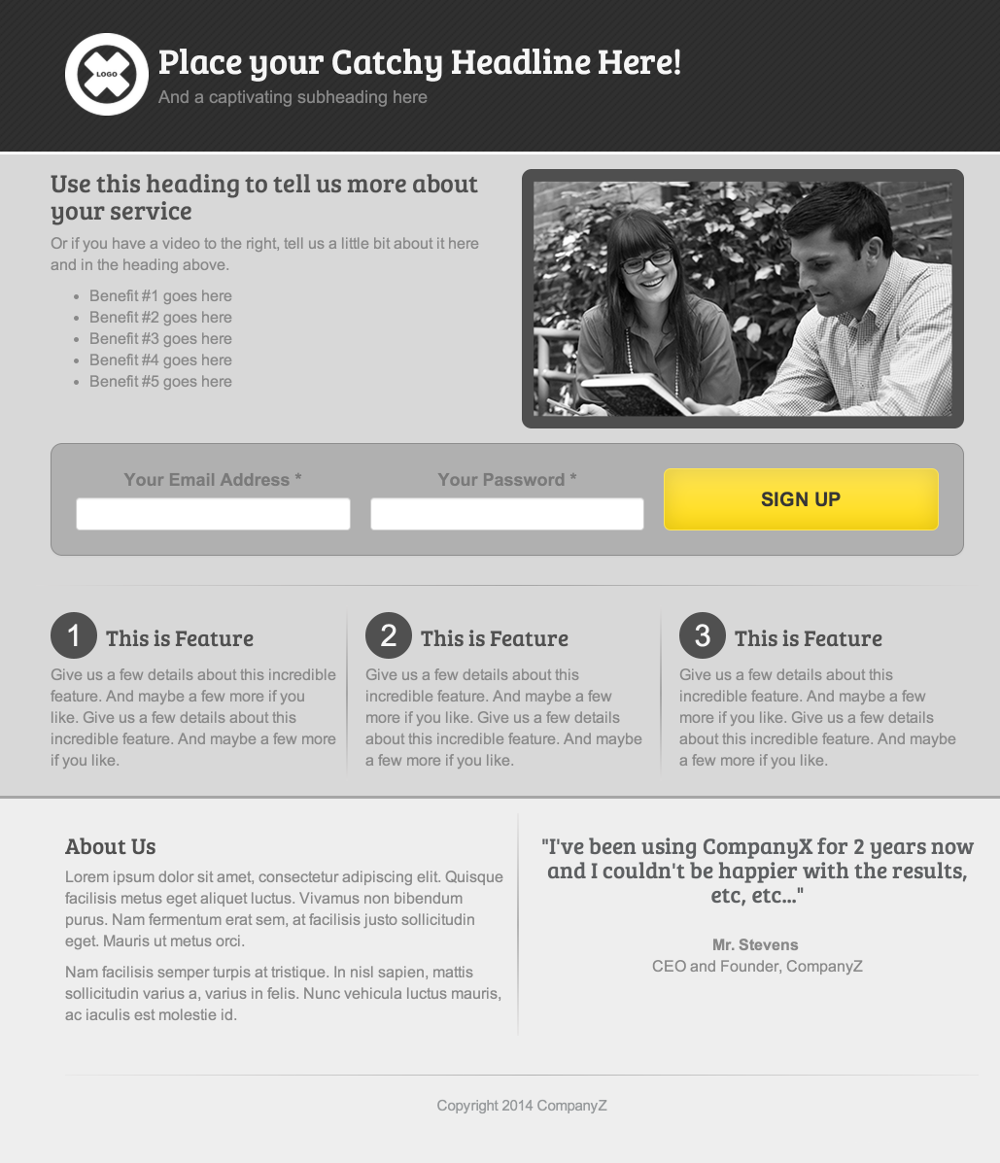
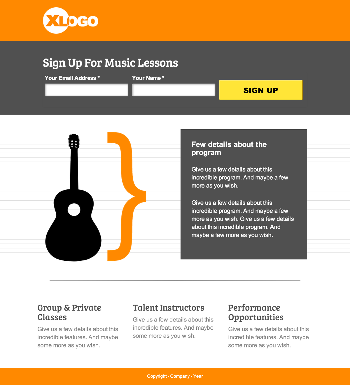
Let’s check out a few examples of landing page templates optimized for conversion:
Although creating a landing page is simple with a third party provider like Wishpond, optimizing it for conversion is a never-ending process. Let’s take a look.
The Five Steps to Create a Landing Page that Converts
1. Decide on your USP
Your USP (Unique Selling Point) is what sets your business apart from others. It’s what you have that your competitors don’t.
Your landing page needs to communicate this point immediately and obviously. Studies show you have less than a second to convince a visitor to your landing page that they should stay and engage.
Your USP can be communicated in three ways:
-
The headline
-
A supporting headline or sub-header
-
A value proposition
Your USP (along with an image) is what grabs the attention of a visitor. If that USP isn’t worth looking into, your page will see a high bounce-rate and you’ll have to rethink.
5 USP and Value Proposition Ideas:
-
Put the monetary value of your product or service in simple terms
-
Use the word Free – making the risk vs reward ratio ideal
-
Create a positive comparison to a well-known brand
-
State the expected return-on-investment
-
Offer success, either long-term or immediate
2. Choose an Appealing Image, Video or Graphic
Visuals grab the attention of your landing page traffic. They also communicate ideas much easier than text. Have an attractive product, or shop-front? Test including a picture of them in your landing page. This increases the visual appeal of the page and encourages your business’ reputation as personable.
A/B Tests and numerous case studies have shown the most effective image in online marketing and advertising to be a picture of a smiling person.
I highly recommend testing the effectiveness of different images for your own business’ audience. Your site-visitors may respond more to text, color or even an image of a beach than that of a person. Then again, they may like a video, or no image at all. Track your new page’s conversions carefully, and see what works for you. Your CTA is one of the most important variables within your landing page. I mentioned above that your landing page is what focuses an internet user’s attention where you want it. Your landing page’s CTA is the center of that focus. It gives them a single option for action. Making it clear, contrasting in color, and appealing is a vital part of a successful landing page. 5 Call-to-Action Ideas:

3. Choose a Solid Call-to-Action:

While you may find success with multiple CTA’s on the same landing page, it’s essential that you have them traffic to the same end point.
Your landing page needs to have a single focus, as any distraction will increase the page’s bounce rate.
4. Include a Short but Clear List of Benefits:
Providing 3-5 benefits is the second part of your page’s USP. Your headline and value proposition grab their attention in less than 5 seconds. They decide to engage further, and it’s this short and obvious list of benefits that really sell them on your desired action.
Give the page visitor a little more information about who you are, what value they’re getting for engagement, and what sets your business or product apart from competitors:
I recommend sitting down and establishing the five selling points based around your business or product.
Remember to brainstorm benefits that your business can 100% come through on.
If recent studies of your product show an average increase of 50%, quote 35.
Use the most appealing of these (I like dollar values) for your initial headline, subheader or value proposition.
The next four write as single sentences (if not phrases) in list form.
I cannot emphasize ‘list form’ enough. It’s essential that this information be bullet-pointed or numbered, as any paragraphs on your landing page will reduce focus and, again, increase your bounce rate.
5. Involve a Trust Symbol or Social Endorsement
Let’s face it, you’re not exactly the most unbiased source when it comes to how awesome your business is. And your landing page traffic knows this.
Because of this, the simple addition of a trust symbol to a landing page has been known to increase conversions by 42%.
Customer testimonials work by providing proof of the legitimacy of your product or business. People, especially social media users (where much of your landing page traffic will come from) value the word of their peers or a respected authority. It’s also helpful to include an image of the customer you’re quoting, as this increases their trustworthiness (and therefore yours).
Creating a Landing Page that Converts using Wishpond’s Landing Page Tool
3rd-Party Landing Page Apps like Wishpond’s make converting internet traffic simple and easy. A 3rd-part App will do the research for you, calling on years of optimization experience to create cutting-edge landing pages that work.
-
Fill out a tried and tested landing-page template in minutes
-
Create landing pages for sales, lead generation, contests, mobile and more
-
Seamlessly integrate your landing pages with contests, email and Facebook Ads to maximize your ROI
-
We do your testing for you, constantly upgrading our templates as technology and optimization develops.
Warning: array_merge(): Argument #1 is not an array in /var/www/html/wp-content/plugins/seo-facebook-comments/seofacebook.php on line 488
Warning: Invalid argument supplied for foreach() in /var/www/html/wp-content/plugins/seo-facebook-comments/seofacebook.php on line 490


