 The final countdown is on. Facebook Timeline for Pages, announced earlier this month is going live on Friday, the 30th of March. Many of you have already changed over to the new format. For those who haven’t you still have a few days to get prepared.
We have been busy working away on new, improved versions of our applications, and we wanted to share them with you so you know what is going to be happening come Friday. All of these changes will be going live automatically, so you don’t have to do a thing.
Wishpond Social Store
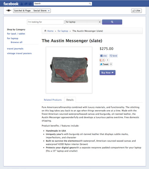
Our Social Store app is getting a major makeover. The new wider canvas means that we can display the products in a 3-product-wide grid with category navigation on the left-hand side. The focus of the new design is making your products the stars. We have attempted to make the Social Store application look and feel like something that blends seamlessly with the Facebook environment. We think you are going to like it. Check out some examples of the different pages below: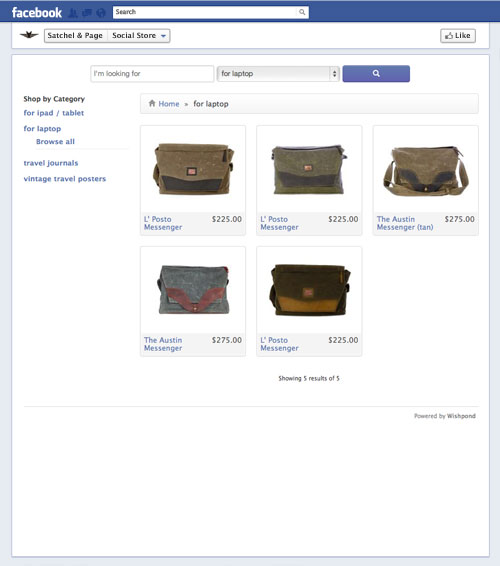
Wishpond Social Offers
If the Social Store got a makeover, then Social Offers has undergone radical cosmetic surgery. Again, the wider canvas gave us more room to play with. That means we can now incorporate a larger image. We have also redesigned the layout to better emphasize the important details of you offer, and incorporated comments to add engagement to your Social Offer. Check out this example: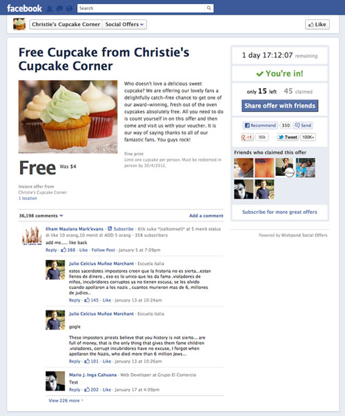
Wishpond Mall360
The Facebook app that is part of our Mall360 product offering has also been completely redesigned with Facebook Timeline in mind. The app gives you a chance to showcase your Mall brand personality with a large header image, as well as making searching and browsing for products significantly more intuitive. Featured items are also more prominent, giving you a chance to show off your retailers best offerings. Here is a sneak preview: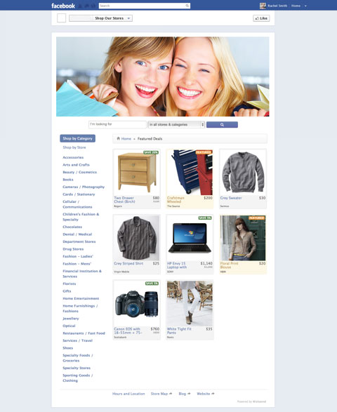 If you are still busy putting together your Facebook Timeline Page you might also like to check out:
- Free Icons for your Facebook Timeline Applications
- A Simple List of Do’s and Don’ts for your new Facebook Timeline Brand Page

Thanks Carlo. I guess you meant ‘TheFancy’. Adding those sharing options is on our list, so look out for them coming soon. Great tip!